Nourysh x Purdue
Project Duration
17
weeks
Team
6
designers
Timeline
Jan - May
2025
My Role
User Research, Wireframing,
Interaction Design, Prototyping
From Clunky Browsing to Seamless Shopping
When Nourysh launched in late 2024, it carried a bold vision: empower small businesses and underrepresented entrepreneurs by giving them a platform to share their products with discerning shoppers who value quality, craftsmanship, and cultural relevance.
But there was a problem.
Shoppers who landed on the Nourysh website often found themselves frustrated—redirected to third-party sites, unable to purchase from multiple sellers at once, and struggling to rediscover products they had seen before. Meanwhile, sellers lacked the visibility and tools they needed to build lasting customer relationships. Nourysh’s mission was clear, but the experience didn’t yet match the ambition.

Our Challenge
As a Purdue Experience Studio team, we were tasked with reimagining Nourysh’s platform as a mobile-first experience, one that would not only solve these pain points but also compete with established e-commerce giants while staying authentic to Nourysh’s identity.
We asked ourselves:
How might we design a mobile app that increases liquidity — making it easier for buyers to find what they love and for sellers to connect with the right customers — without losing the heart of Nourysh’s community-driven mission?
The Design Journey at a Glance
We began with research: competitor audits, heuristic evaluations, and interviews with Nourysh’s customer support team. We learned that shoppers wanted clarity, trust, and convenience, while sellers craved visibility and direct communication with buyers.


Heuristic Evaluation + Info Arch
Through a heuristic website evaluation. We learned some key issues and opportunity areas — such as users being unable to check out items from multiple sellers, users being redirected to a seller's page when they click on a product link, etc.


Competitor Analysis
We looked into similar or adjacent e-commerce platforms such as Etsy, Depop, Amazon, etc, to analyze the features they offer both businesses and sellers.


Interviews
We interviewed 4 stakeholders and organized our found insights into several categories. After that, we brainstormed preliminary ideas through triangulation of interview insights, stakeholder (or business) needs and competitive analysis
The Solution


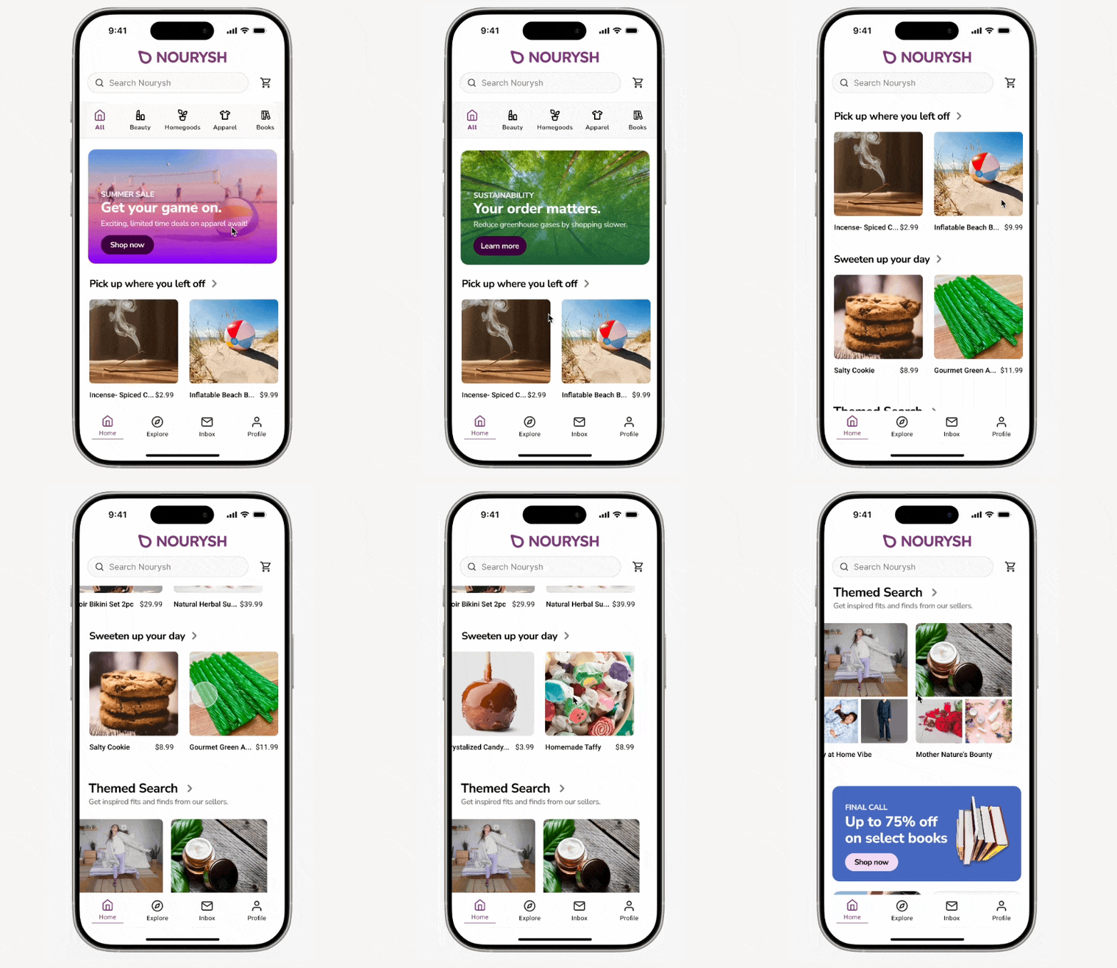
Home
Distinguished Category Navigation, Hero Section Carousels, and Seasonal Features collectively streamline the shopping experience by reducing decision fatigue and providing timely relevance.
By presenting featured products prominently in a horizontal scroll on the first fold, users are immediately exposed to high-interest items, minimizing effort and encouraging exploration. Together, these elements guide focus, create urgency, and enhance contextual appeal, ultimately motivating faster decisions and increasing conversions.
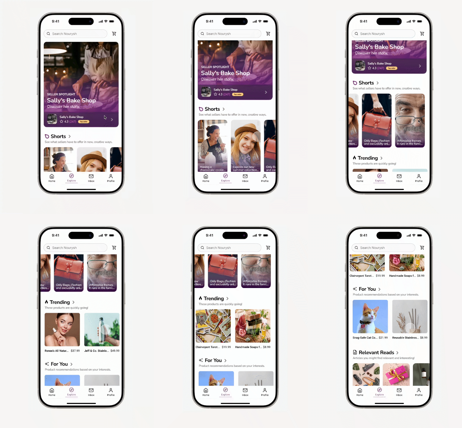
Explore
The Explore screen combines dynamic storytelling, personalized recommendations, and curated seller visibility to transform passive browsing into engaged discovery. Short, scrollable content and seller stories immerse users in modern, interactive experiences that build trust and emotional connection. Personalized product recommendations and trending items to reduce search fatigue and encourage faster decisions.
Together, these modules create meaningful, high-intent purchase journeys while boosting seller visibility in a content-forward environment.


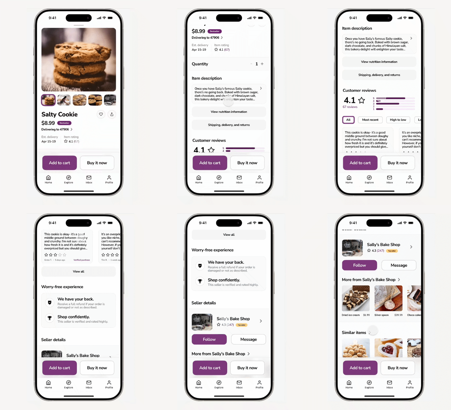
Product Listing
The product listing screen builds trust and reduces hesitation by surfacing key details early, including nutrition and delivery info, ratings, and review filters for easy comparisons.
Authentic testimonials and clear review metrics provide transparency, while verified seller badges and confidence notes reassure users with platform-backed trust signals, making decisions faster and more confident.
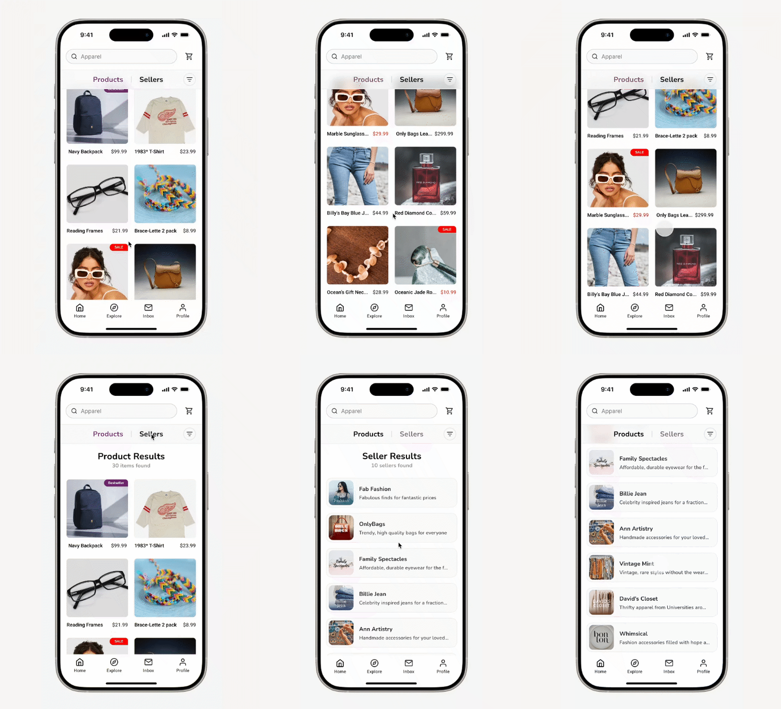
Product/Seller Listing
The product listing screen streamlines browsing with clear filters, sort options, and a toggle between product and seller views, supporting both product-focused searches and seller-led discovery. Product cards highlight essential details—pricing, quality images, and tags like “Bestseller”—to build trust and speed decisions, while seller cards surface relevant storefronts tailored to user behavior.
Together, these features reduce friction, enhance transparency, and balance buyer efficiency with seller visibility, creating a more personalized and intuitive shopping journey.
_edited.jpg)
